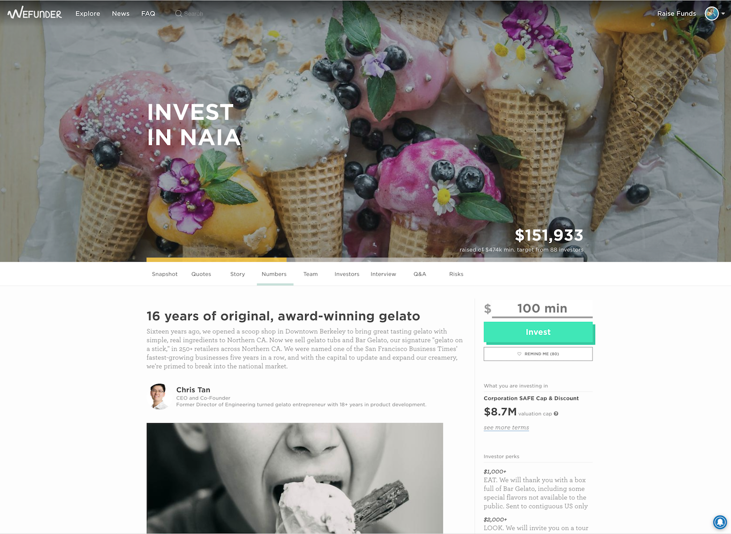
Looky here, we have new company profiles! (For above the fold anyway).
What is it?
It's a company's dating profile. Investors use it to decide whether or not to make the leap.
What's wrong with it?
For starters, it's 2 years old. The layout cramps a lot of key information together, forming a text wall that is hard to jump over.
Because of this, a lot of key information is being glanced over. We want to do our part to emphasize the right information and educate investors that these are the main points to worry about.
The main challenges:
It Needs to be One-Size-Fits-All
- Various campaign types — this design has to be flexible enough for Regulation D, Regulation A+, and Regulation CF campaigns.
- Various contract types, including custom contract types that have different emphases and important takeaways.
- Various states the profile page can be in - live, early bird, oversubscribed, launching soon, closing soon, invested or not invested yet, founder view, etc.
- Multiple purposes - founders could be using the profile to get investor, just to gain a following, or as proof of concept for their Reg CF campaign.
- Lots of content.
Education
- Each profile is a mini education in that company, the industry, and the security type they are using.
- How do we teach investors what information to focus on? (Valuation Cap for a SAFE, how to spot a good company, how to spot a good founder).
Be Good, Not Sales-y
- Balance between encouraging excitement to 'invest' and making sure users actually take time to do homework and invest for the right reasons.
The Old:
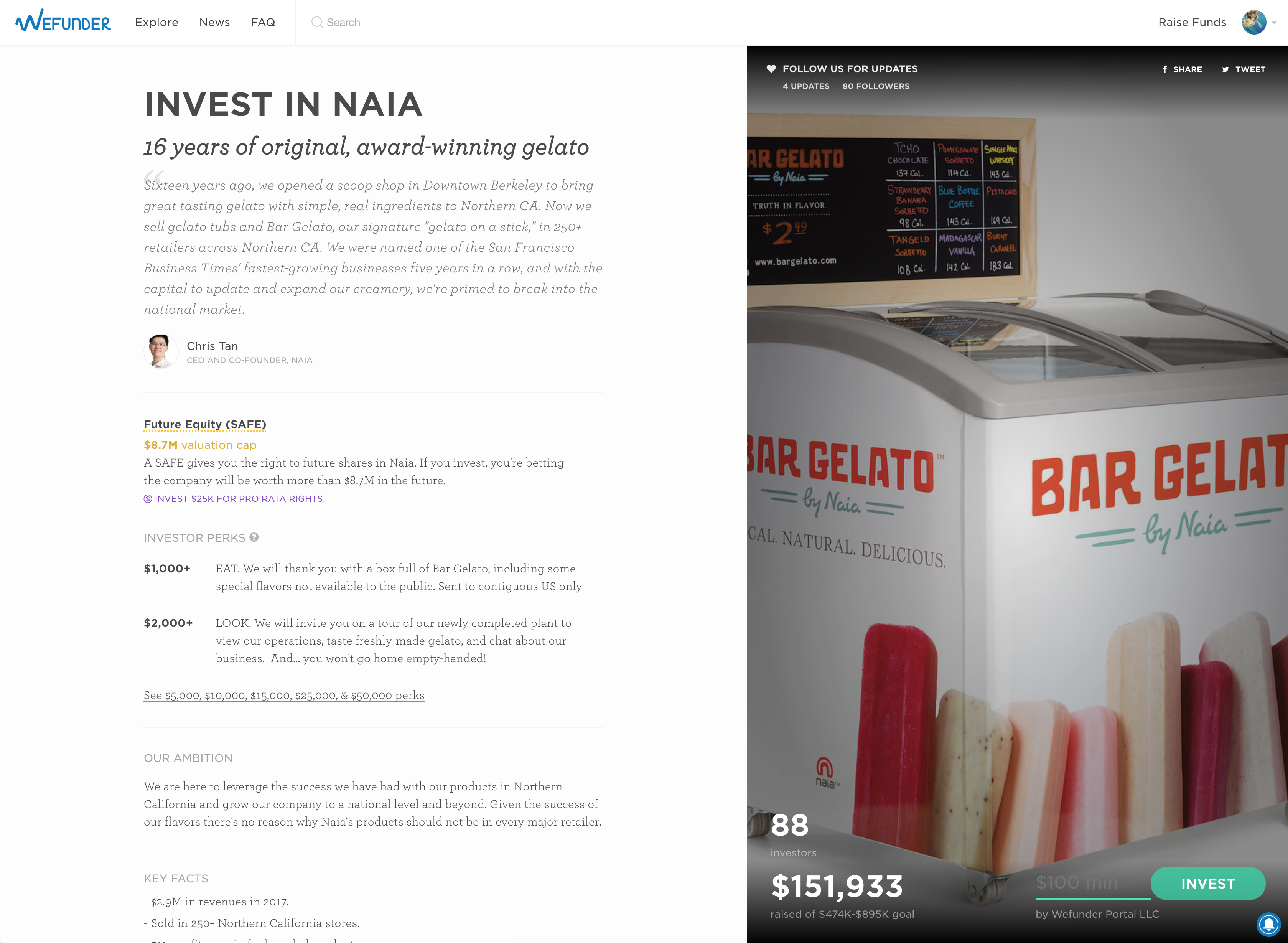
The New:
There are currently four types of profiles you might encounter in the wild: Gather Following, Launching Soon, Live Campaign, and Closing Soon.
Following:
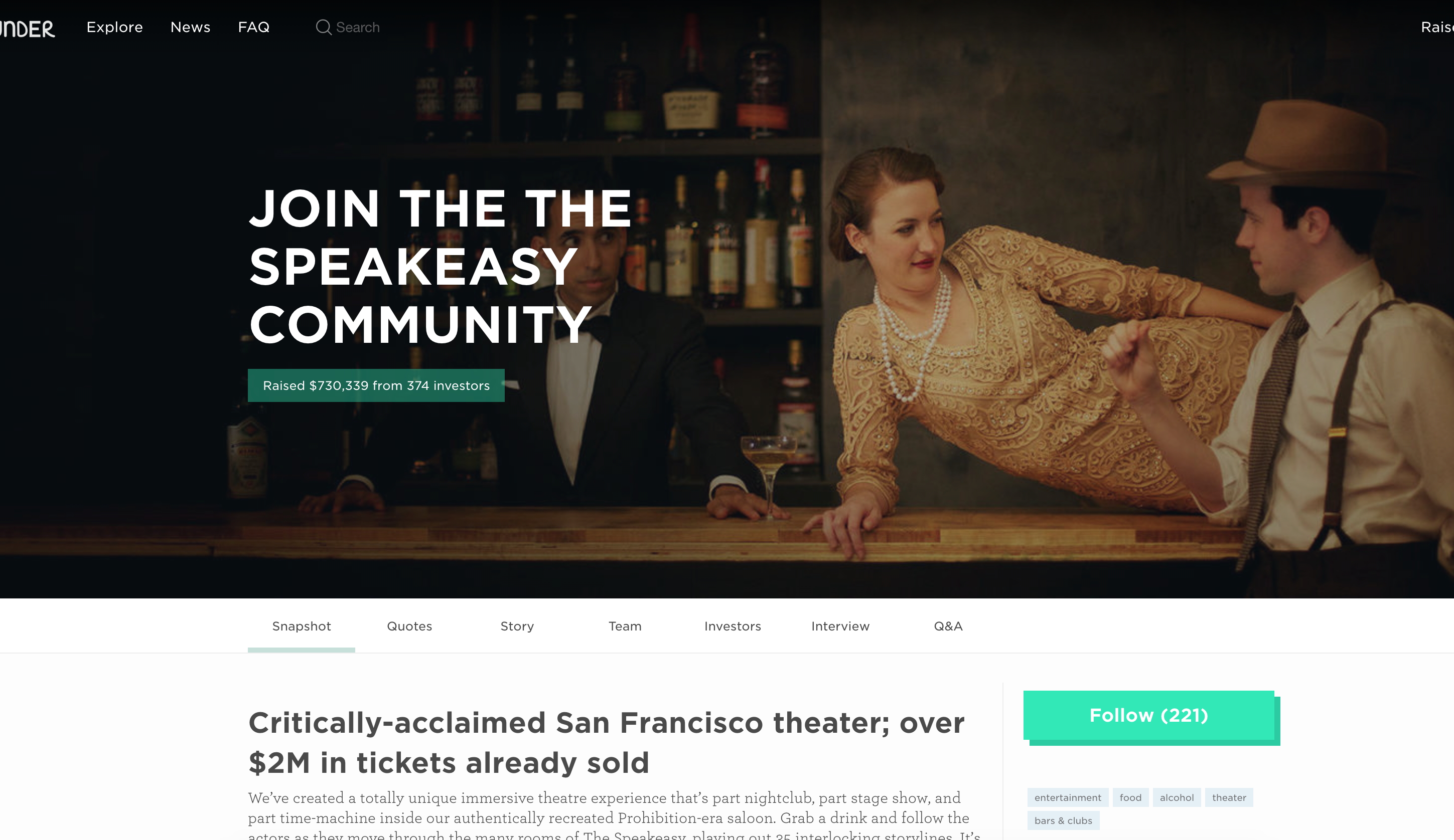 For companies that are not fundraising. If there were past raises, the page will indicate whether it was a successful raise, amount raised, and date closed.
Launching Soon:
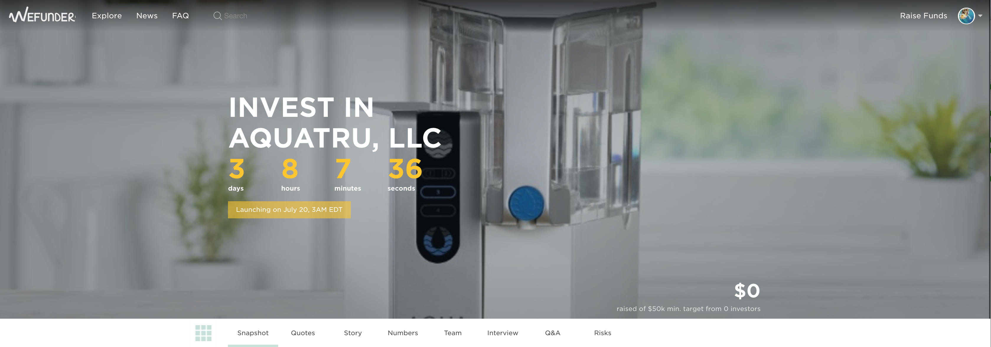 The Launching Soon variation comes with a countdown to launch to create following. Investors can reserve investments when campaigns are counting down. This clock is set once a launch date has been decided by the company and Wefunder's campaign managers. When the company officially launches, the reservations will be converted to investments. The purpose of this page is to help the company create momentum, one of the key contributors to a successful campaign. Once there is momentum, the pool of 160,000 investors on Wefunder will jump in and help the campaign reach its funding target.
Live Campaign:
 Pretty self-explanatory. All live campaigns after the official launch and before a closing countdown begins are in this state.
Closing Soon:
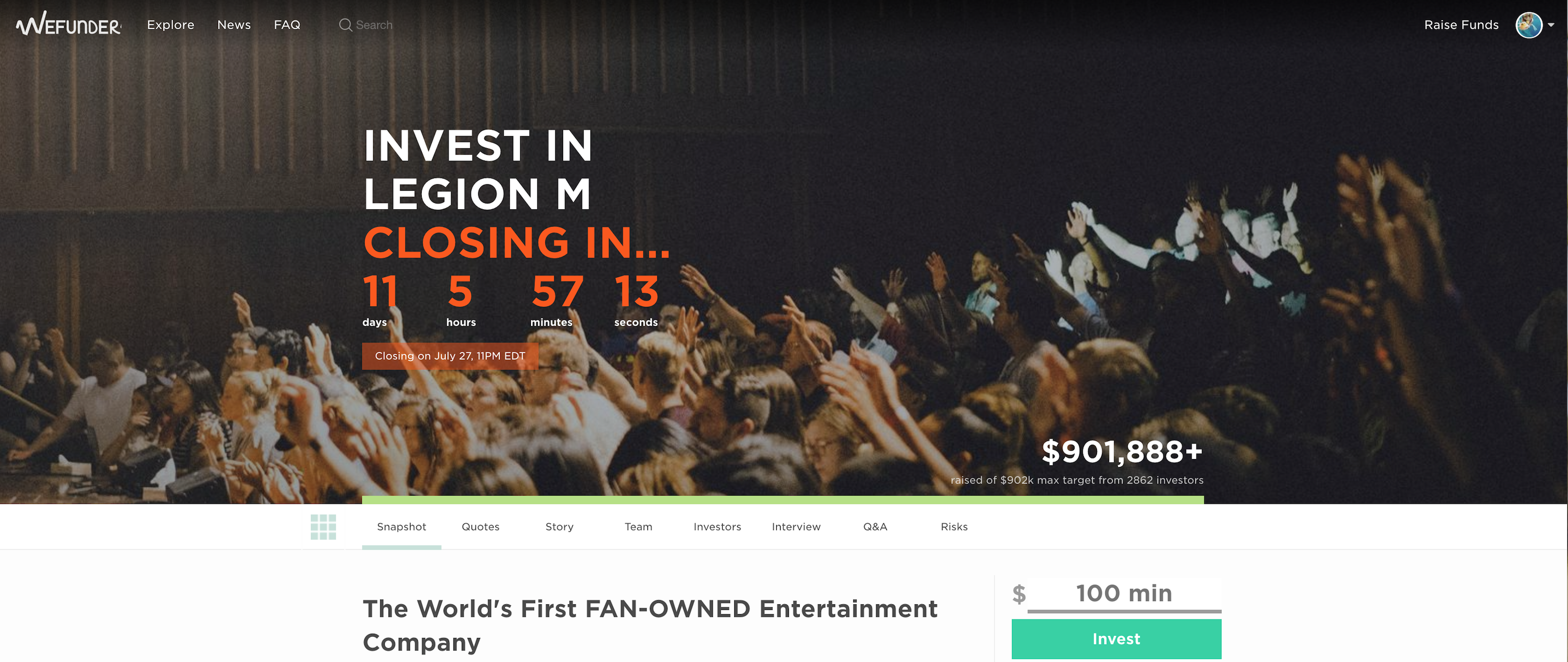 Once a company officially sets the closing date, a countdown will appear. Otherwise, the page resembles the Live Campaign variation.
Let's talk details about the design.
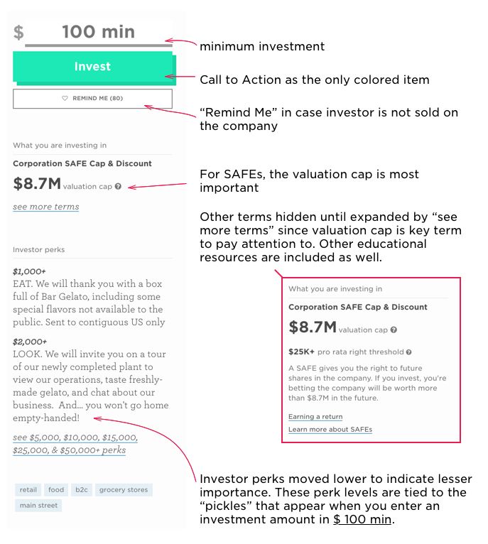
The Side Panel
If the company has Early Bird discounts, the terms section will indicate so:
If you expand the terms, you'll notice the early bird highlighted in orange as well.
Now let's talk about these "pickles"
When you first load the page, the "Invest" button looks like the first image on the left. If you focus on the entry field and type a number, some "pickles" with investment tiers will appear. These tiers are tied to the perk levels that the company has set. If you enter a number corresponding to the tier or click on any of the pickles, you'll see more detail about the specific perk underneath.
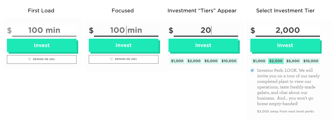 The intent of this is to give investors grounding. Often times people have no idea what's a "good" investment amount. Should it be $100? $500? $50,000? Of course you should only invest what you are comfortable with losing. But because it's a common mental model that investments in companies are large sums of money, investors sometimes assume they need to be wealthy to be an investor. These "pickles" are intended to show the investors otherwise.
Additionally, I wanted some interaction here so you only show information (perks or pro-rata rights) when it becomes relevant. Plus, all the necessary information in one place.
The Progress Bar
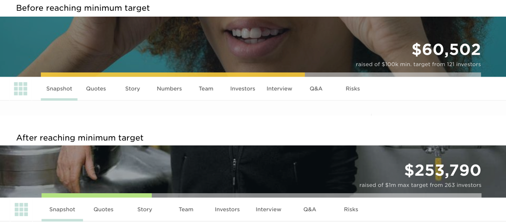
Each company sets both minimum and maximum fundraise targets. Since the campaign fails if the company does not reach the minimum, the primary focus before then is the minimum goal. Initially, the progress bar indicates progress towards minimum goal — indicated by yellow. Once the minimum goal is reached and campaign successful, the progress bar changes to green, with progress towards the maximum goal.
There's a pending question of whether users would understand that once the campaign reaches the minimum and will not be cancelled, the goal is changed to max goal and progress bar changed to green from the original yellow.
Which do you think more clearly conveys that campaigns must reach minimum goal to be successful?
The current way or the method below?
A few things we're still pondering...
What would deem this design update as a success?
How can we make this better?
What are your thoughts?
Shoot me an email at chia@wefunder.com. Happy to chat.
