
With a major update in the wings and the maturing of our technology, we felt it was time to give the brand identity an overhaul too. Nothing too radical, we love our resonating triangle and vibrant color.
But as with the app we wanted to simplify the look and feel while keeping things very familiar to our users. We didn’t want much to change, we just wanted it to evolve, to grow up a bit, and reflect the ever increasing vitality of our community.
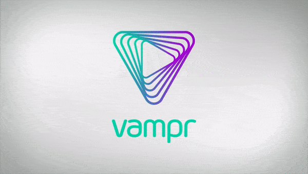
So we started with the icon, trimmed a couple of the triangles, made them bolder and fixed the curves. We kept the ‘Play’ triangle at the centre and pointing the right way. We then rotated the outside triangle so the icon locks up better with the type, both horizontally and vertically. And finally, gave the colours a bump to dial up the energy.
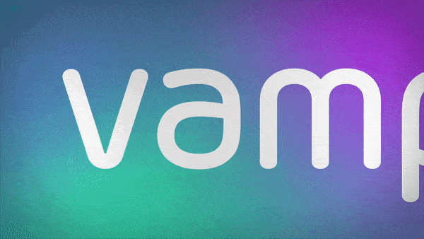
Now that the icon was working better we updated the type to match. Thickening the stroke, spacing the characters and softening the rounded terminals were all done to balance the type mark with the icon in the new lock-ups. Then we looked at simplifying the type by changing the ‘a’ to a single story ‘a’ and added mirrored raised elements to the ‘a’ and ‘p’.

Bringing it all together we now have a brandmark that better balances its components. It works well in colour or reversed. The icon and type mark work well on their own and can also be used for secondary branding.
Overall we achieved what we wanted: an evolution to a stronger, harder-working version of our brandmark.